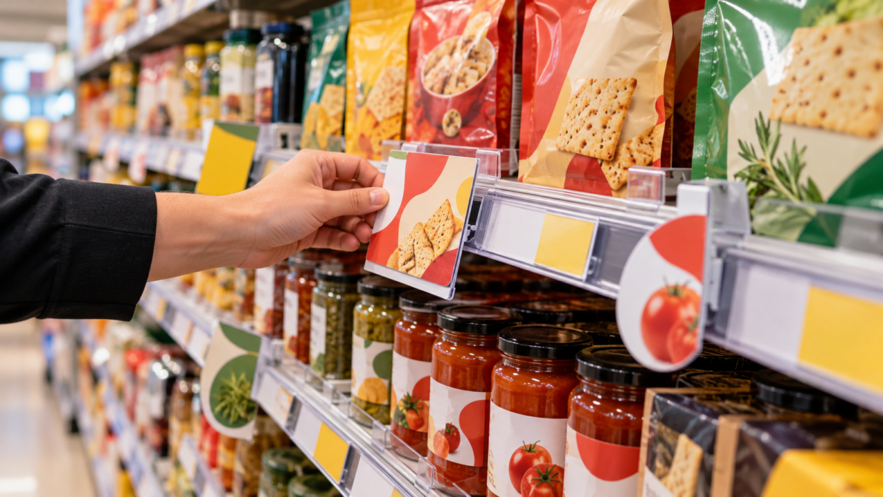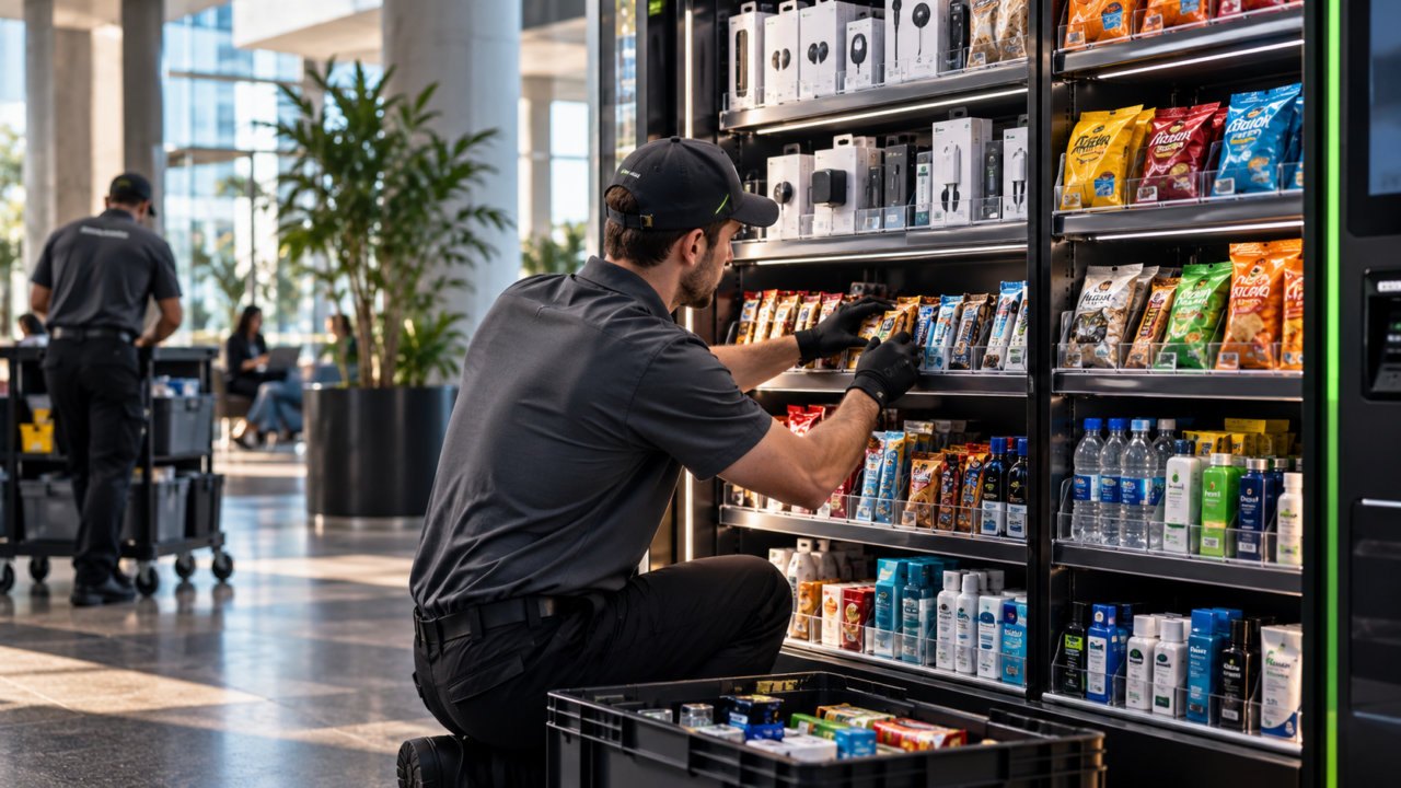




A layout decision made once governs every merchandising decision afterwards. Where the category sits determines how many shoppers pass it, and no amount of shelf work recovers a category placed where nobody walks. Yet layout tends to be revisited only during a remodel, while planograms get reworked several times a year.
This guide covers what store layout means, the four patterns in general use, the zones inside any store that behave differently, and what has to be re-done when a layout changes.
What is store layout?
Store layout is the arrangement of fixtures, aisles and departments across a selling floor, and the circulation pattern that arrangement creates. It governs where categories sit relative to the entrance, how shoppers move between them, and how much of the store a typical visit passes through.
It sits one level above the shelf. Layout answers “where does this category live and how do people reach it”. A planogram answers “what goes on this fixture and in what order”. Changing one without the other is how execution problems start.
The four store layout patterns
| Layout | How it works | Suits | Trade-off |
|---|---|---|---|
| Grid | Parallel aisles in a repeating pattern | Supermarkets, drugstores, hardware | Highly efficient and predictable; little browsing, and shoppers skip whole aisles |
| Loop (racetrack) | A single main path circling the floor past each department | Department stores, large format fashion, furniture | Maximises category exposure; can feel long when a shopper wants one item |
| Free-flow | Fixtures grouped without a fixed path | Fashion, beauty, specialty, boutiques | Encourages browsing and feels premium; costs space and can disorient |
| Hybrid | A loop around a grid core, or free-flow zones inside a grid | Most mass and big-box retail in practice | Flexible, but the transitions between zones need signage to work |
In practice almost no large store is purely one pattern. A supermarket runs a grid through the centre aisles with a free-flow produce area and a perimeter loop. The useful question is not which label applies but whether each zone is doing the job that zone is suited to.
The zones inside any layout
The decompression zone. The first few metres inside the entrance, where shoppers adjust from outside to inside and are still orienting. Merchandise placed here is frequently walked past without registering. It is best used for baskets, orientation and a single large, simple message.
The power wall. The first substantial wall a shopper sees, usually to the right as they enter in markets where people drive on the right. It carries strong first-impression merchandise and sets the tone for the visit.
The main path. The route most shoppers take without deciding to. High traffic, and the positions along it are the most valuable on the floor after the entrance.
Destination zones. Where categories people came specifically to buy are placed, usually deep in the store. This is deliberate: the walk to them passes everything else, and that walk is where unplanned purchases happen.
Dead zones. Corners, dead ends and the stretch immediately after a strong display, where attention drops. Worth knowing so low-involvement stock goes there rather than a category you need to perform.
The transition and queue. The approach to checkout, where shoppers are no longer searching and are receptive to small, low-consideration items.
What a layout change actually costs
Moving a category is never just moving the shelving, and underestimating the dependent work is the most common way a remodel overruns.
- Every planogram for the moved category may need redrawing if bay count or bay width differs in the new position.
- Departmental and category signage becomes wrong immediately. A sign pointing at a category that moved is worse than no sign.
- Adjacency decisions have to be remade. A category that performed partly because of what sat next to it may not perform in isolation.
- Store team knowledge resets. Staff direct shoppers from memory, and for several weeks they will direct them to the old position.
- Compliance baselines break. Measuring improvement against a pre-move baseline compares two different stores.
This is why a layout change is scoped as a reset rather than a refresh. If the product ends the day somewhere different, the plan documents, the signage and the measurement all move with it.
How to evaluate a layout you already have
- Walk it as a shopper looking for one specific item. Time how long it takes and note every point where you had to guess. Each guess is a signage gap or a layout problem.
- Map which aisles get skipped. Traffic data if you have it, observation if you do not. A consistently skipped aisle is a placement problem, not a merchandising one.
- Check what sits in the decompression zone. If it is merchandise you need to sell, it is in the wrong place.
- Test the route to your destination categories. If the path is short and direct, you are getting the sale without the browse.
- Verify adjacencies deliberately. Categories bought together should be reachable without crossing the store.
- Audit signage against the current plan, not the last one. After any move, this is where errors concentrate.
A caution on benchmarks
Layout advice circulates as rules: this percentage of space to that category, this many metres of main path. Those numbers come from specific formats in specific markets and transfer badly. A convenience store, a category killer and a department store are solving different problems with the same vocabulary. The useful measure is internal: establish how your own stores perform by zone, then change one thing and measure against that.
Where a field team fits
Layout work concentrates into remodel and reset windows, needs consistency across banners a brand does not control, and generates a large amount of measurement in a short period — the profile that suits visiting coverage rather than store labour. It also needs someone whose job is the floor rather than the store, because the person executing the move should not be the only one reporting on whether it landed.
T-ROC runs reset and remodel execution with per-store surveying, photo evidence on every visit and field teams reporting by door rather than by region. Talk to our team about what a layout and compliance audit would show across your estate.
Frequently Asked Questions
What is store layout?
Store layout is the arrangement of fixtures, aisles and departments across a selling floor, together with the circulation pattern it creates. It governs where categories sit relative to the entrance and how shoppers move between them. It sits one level above the planogram: layout decides where a category lives, the planogram decides what goes on the fixture once a shopper arrives.
What are the main types of store layout?
Four patterns cover most retail. A grid runs parallel aisles and suits supermarkets and drugstores, trading browsing for efficiency. A loop or racetrack sends shoppers along one main path past every department. Free-flow groups fixtures without a fixed route and suits fashion and beauty. Most large stores are hybrids, running a perimeter loop around a grid core with free-flow zones inside it.
What is the decompression zone in a store?
The first few metres inside the entrance, where shoppers are still adjusting from outside to inside and have not begun shopping. Merchandise placed there is routinely walked past without registering, so the space is better used for baskets, orientation and a single large, simple message rather than product you need to sell.
What is the difference between store layout and a planogram?
Layout is the floor plan: where each category sits and how shoppers move between them. A planogram is the shelf plan: what goes on a specific fixture, in what order and with how many facings. Layout changes are infrequent and expensive; planograms are reworked several times a year. Changing the layout without redrawing the affected planograms and updating the signage is a common cause of execution failure.
Why are destination categories placed at the back of a store?
Because the walk to them is the part that sells. Shoppers who came specifically for that category will cross the store to reach it, and the route passes everything else, which is where unplanned purchases happen. Placing a destination category near the entrance delivers the sale without the browse, which is why milk and pharmacy counters sit where they do.
What has to change when a store layout changes?
More than the shelving. Planograms for the moved category may need redrawing if bay count or width differs in the new position. Departmental and category signage becomes wrong immediately, and a sign pointing at a category that moved is worse than no sign at all. Adjacency decisions have to be remade, store teams will direct shoppers to the old position for weeks, and compliance baselines reset.
How do you evaluate an existing store layout?
Walk it as a shopper hunting one specific item and note every point where you had to guess, since each guess is a signage or layout gap. Map which aisles get skipped consistently, check whether real merchandise is sitting in the decompression zone, test how direct the route to destination categories is, and verify that categories bought together are reachable without crossing the store.